Posts by Chelsée Cure
Graphic Design Trend Predictions For 2026
- by Chelsée Cure
With the increasing ubiquity of AI-generated content, the graphic design industry is grappling with one central question: How do we bring the human back into the craft? Design is a direct reflection of culture, and we are seeing a shift toward punk, counter-culture imagery and a deliberate push-back to the hyper-polished, minimal designs of years past.
The year 2026 will be defined by a dynamic tension: a powerful push toward human presence, texture, and craft and a simultaneous, intentional embrace of engineered precision and drama. So how is that going to look?
The Human Touch: Curated and Messy
The most significant trend is a cultural rejection of sterile perfection. Designers are leveraging imperfection and physical textures to create authenticity and connection in a world saturated with clean, seamless AI output. This shift marks the return of texture and visual depth, moving away from minimalist, flat designs. These rejections will go in a number of directions.
Entering our Rebellious Teenage Era
We’re seeing a major uptick in counter-culture aesthetics, we’re seeing chaotic, high-energy designs, deliberately unpolished or loud typography and gritty textures that revolt against the clean minimalist perfection of previous years.
Grit and Grain
After years of sleek, perfect digital looks, graphic design is now embracing imperfect and gritty textures. This popular trend uses elements like film grain, intentional blurring, rough edges, faded colors, and worn paper effects to give designs a more raw, authentic, and candid feel. It looks like old-school film photos or handmade collages, intentionally moving away from sterile perfection. This shift is happening because both people and brands want to feel more genuine and human, using these "flaws" to build trust and connection in a world filled with overly polished or AI-generated content.
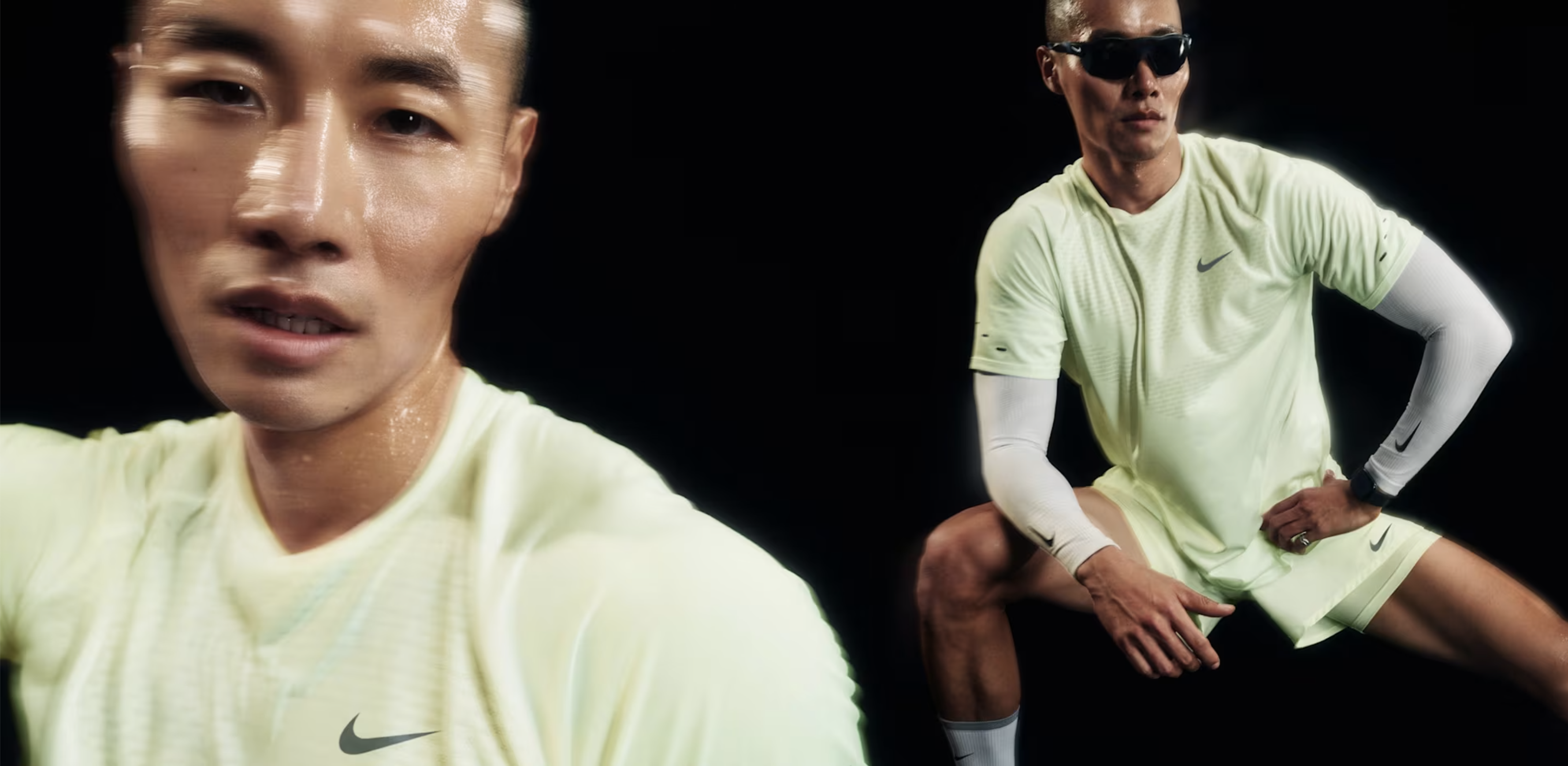 Nike Blurry Imagery
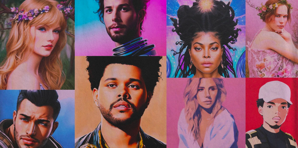
Hyperindividualism
Hyper-Individualism is all about using design to stand out fiercely against everything else. It rejects boring, safe looks by using unique, bold visuals that are hard to ignore. It’s less about following design conventions and more about standing out.
Lululemon social media graphic.
This style relies on custom, highly expressive fonts that are often warped or messy, acting as art themselves. It heavily layers 2D and 3D graphics together, mixing flat shapes with lifelike or totally surreal (dream-like) images to create deep, busy, and sometimes chaotic visuals.
The whole point is to look completely original, making the design feel like a loud, defiant statement of unique personality so it can never be mistaken for anything else.
JBL noise cancelling headphones ad.
Punk, Grunge and Total Anarchy
The noisy, rebellious look of punk and grunge design is very popular again. It's loud, messy, and meant to stand out. It uses textures that look like bad photocopies and features ransom note-style letters that appear cut out and mismatched. With its chaotic layouts, distressed edges, and raw, amateur feel, this aesthetic is the "angry teenager" of design. Its comeback shows that people are craving an authentic, gritty style that rejects perfection and lets them express frustration and individuality.

Get out your glue sticks, it’s craft time.
Hand-Drawn Graphics
This style celebrates hand-drawn imperfections and has a familiar, almost nostaligic feel to it. . This style relies on organic elements like whimsical florals and patterns, along with ornamental, uneven borders that look hand-painted. Colors are often rich and vibrant, giving the designs a feeling of history and cultural connection. It uses simple, heartfelt elements, and offers a comforting and sincere alternative to super-modern aesthetics.

Ikea hand-drawn throw pillow graphic
Tactile Crafts and Collage
The Tactile Crafts trend actively rejects clean digital perfection by bringing a handmade, human feel to visuals. This style is achieved through techniques that make the work look like it was physically put together, not just designed on a screen. Key elements include dynamic collages made from fragmented photography, paper cutouts, messy scribbles, and deliberate unevenness. By showcasing these rough textures and visible layers, the design feels more immediate, sincere, and relatable.

Ads of the World - The Village
Taking tech to the next level
With advances in technology, it’s now easier than ever to feature hyper-realistic visuals and further blend the lines between the physical and digital world. In my early graphic design courses, the question was often “sure, but does it translate to print?”. It feels like we’re letting that focus go and seeing just how much we can do with digital graphics.
Hyper Realistic Visuals
Liquid Glass
The Liquid Glass design style is rapidly becoming a popular aesthetic in modern UI, as seen in Apple’s new OS update. Characterized by high-fidelity realism, it features elements that simulate the optical properties of dynamic, fluid glass, including subtle blurring, light reflection and refraction, and dynamic translucency that adapts to the content underneath. This style creates a sense of layered depth and elegance, making interfaces feel alive and tactile.
Apple Liquid Glass
Skeuomorphism
As we work to blend the physical and the digital, we’re seeing a resurgence of skeuomorphic design; realistic textures and graphics that reflect the physical structure. This design style was very popular in early interfaces as a way to familiarize new users with digital counterparts of things like a notepad, camera, or microphone.

Medium - Early Apple skeuomorphism
The resurgence of this design style is more about realism and blending minimalist design styles with realistic textures; think woodgrains, leather, paper textures applied in the digital sphere.
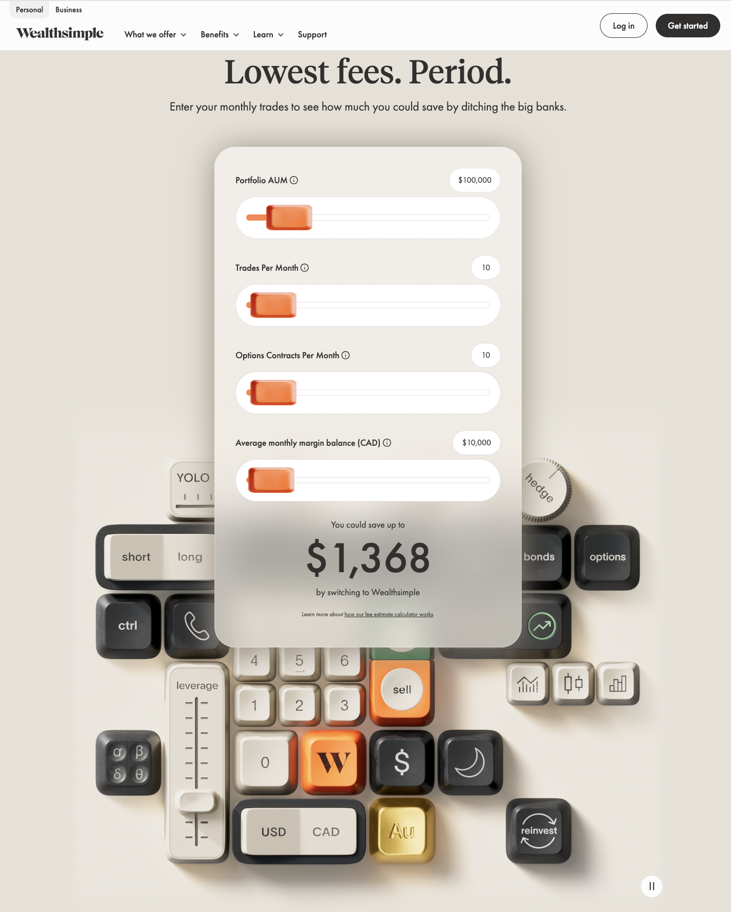
Wealthsimple skeuomorphism
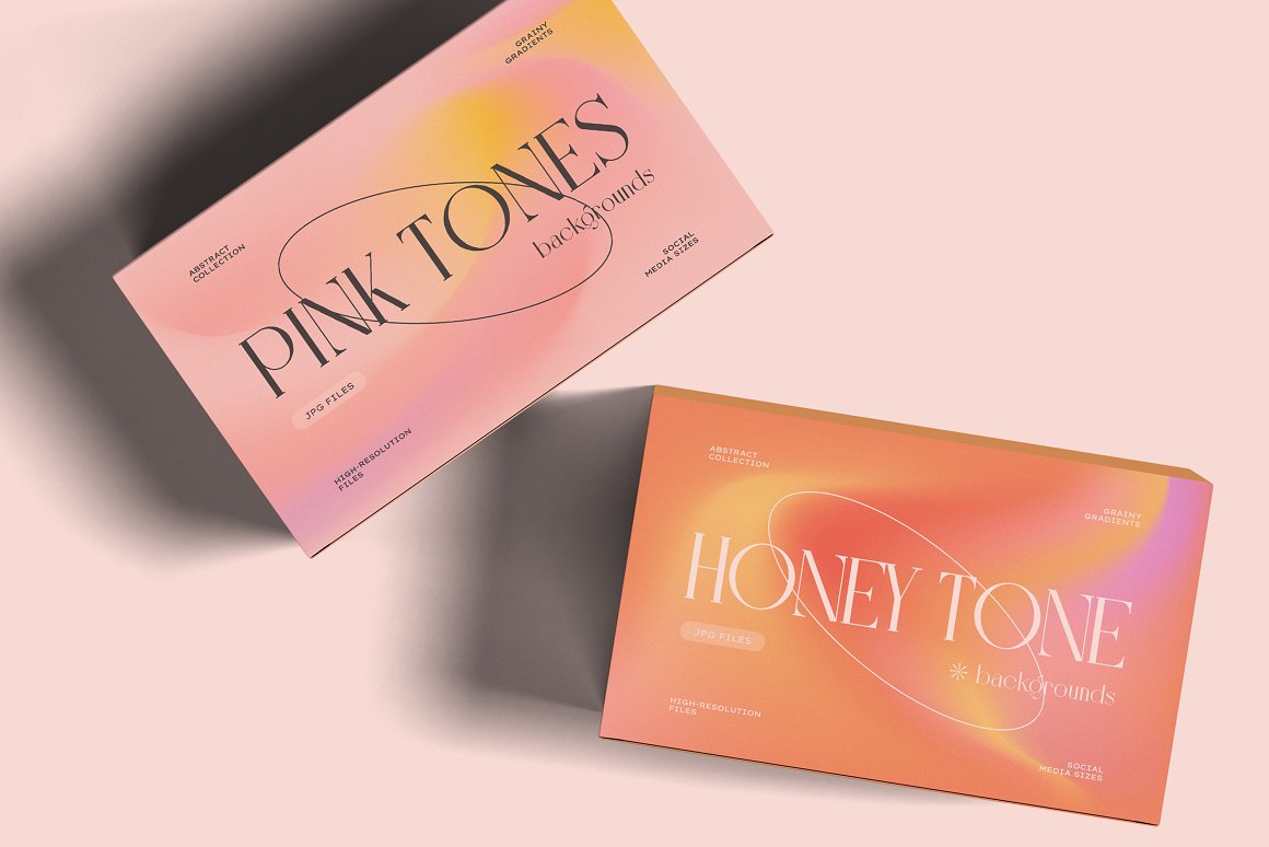
Dynamic Gradients
Google recently changed up their logos to gradient designs, Siri, Open AI, also have gradient design.
Gradients are also being used to add texture, using grainy, pixelated gradients adds some imperfection to otherwise clean and seamless content. Gradients are being used to break up text blocks and create visual hierarchy in an interesting way.
If you can’t beat em, join em.
AI-generated content has been around for a few years. It feels like yesterday our social media feeds were full of Midjourney-generated profile pictures, it was a simpler time. AI is now graduating from being a novelty to a valuable tool in branding and graphics development.
It’s being integrated into designers processes to
- Generate Design Systems: Instantly producing full sets of brand-compliant assets (icons, colour palettes, social templates) from a single prompt.
- Accelerate Iteration: Creating dozens of colour or font pairings for an ad campaign in seconds, allowing the human designer to focus entirely on creative strategy.
The trend isn't the output itself, which can still be a bit dodgy and unpredictable, but the efficiency and personalization it enables. The designer still has the controls and vision, but AI can iterate and speed up previously tedious processes.
The Bottom Line: Authenticity Over Algorithm
I will quote a 90s PSA and say “nobody's good at everything, but everybody's good at something… so what’s your thing?” It’s fun to predict what’s next for the design world, but remember that authenticity never goes out of style. Your goal is not to adopt every aesthetic listed here, but to cherry-pick the elements that enhance your brand story and genuinely resonate with your audience. Trends are exciting, but a consistent, clear brand identity is timeless.
Graphic Design Trends to Watch For in 2023
- by Chelsée Curé
This post was written by our Branding Specialist Chelsée Curé.
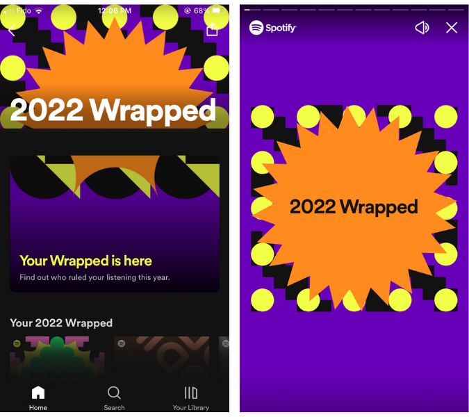
With 2022 inching towards its close, ‘tis the reason for recaps. If it’s not Spotify Wrapped, it’s Google releasing the year’s top searches. Is Instagram top nine still a thing? We’re all for reminiscing, but let’s take a minute to see what’s coming in 2023.
Design trends are often a mirror on the current state of the world. With so much going on right now, 2023 is bound to get interesting. Let’s take a look at some of the things we might expect to pop up in graphic design and branding next year.
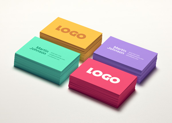
Colour
Taste the Rainbow
If you were one of the more than 120 million people who accessed Spotify Wrapped this year, you were met with bold saturated colours and crazy mosaic shapes.
As Rasmus Wangelin, Spotify’s global head of brand design stated “Since the pandemic, we’ve all started to embrace much more individuality. No one knows what’s cool anymore, it’s so subjective now.”
After a number of years of restrictions and uncertainty, neutral, sterile branding just isn’t going to cut it. We’re seeing bold use of colour across most design styles in 2023.
From warm earth tones to bright Barbie pink to neon cyberpunk hues, be on the lookout for vibrant, saturated palettes in 2023.
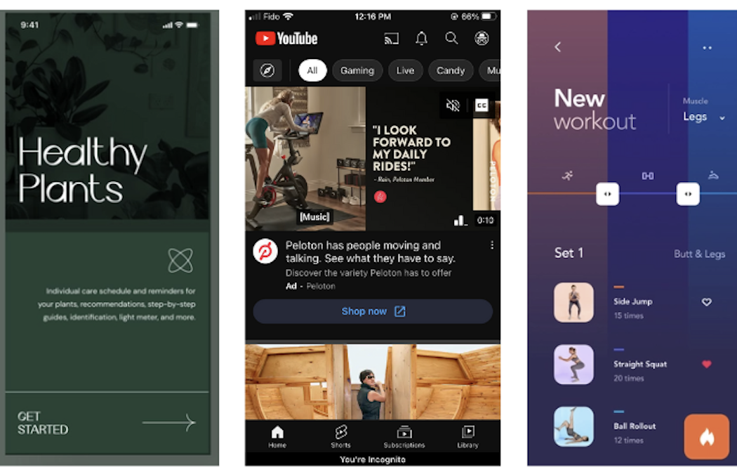
Dark Mode
2022 saw more apps switching to the dark side. Apps like Youtube, Reddit, and Instagram offer users the option to switch to dark mode and 81% of us are making the change. With the majority of us accessing our smart phones for information, it’s no surprise that graphic designers are catching on.
In 2023, we’re going to be seeing a lot more dark mode, but not just the typical black background with white text, expect bold coloured backgrounds like navy, green, and red.
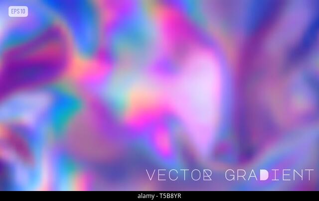
Gradients
The use of gradients have long been used in design. As of late, we’re seeing a lot more use of liquid gradients, which have more shape and visual interest. These gradients offer a retro feel, reminiscent of lava lamps and tie dye.
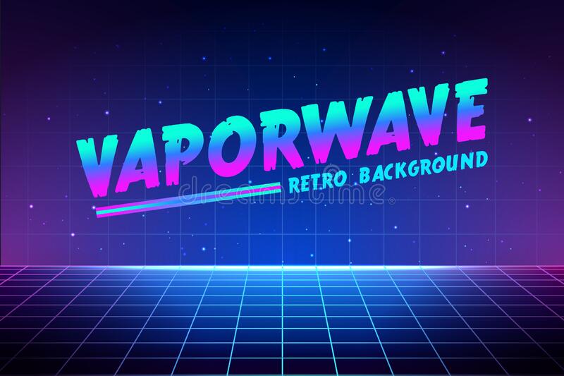
We’re also seeing a lot of gradients used in more futuristic synthwave designs.
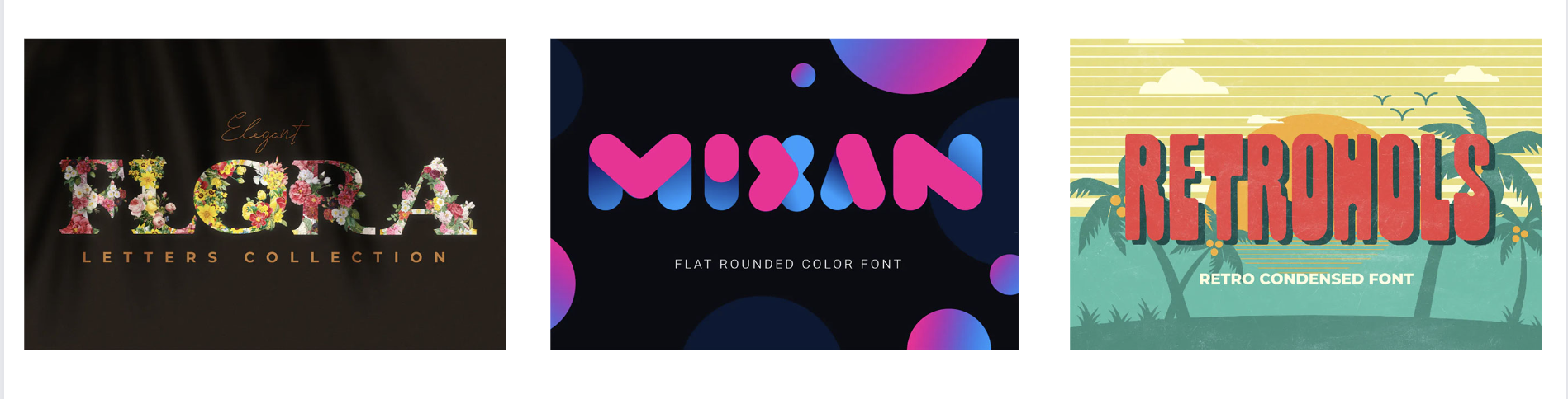
Type
Let the words do the talking
Designers won’t just stop at bold colours for 2023, expect loads of creative expression with type. Whether embracing vintage aesthetic or going full sci-fi, we’re going to see a lot of distorted, embellished and intricate text.
“The medium is the message” is a marketing phrase first coined in the 1960’s but for 2023, the message is the medium, and it will tell its own story.
The Return of Sans Serifs
Serif fonts have been a popular choice over the last few years, but in 2023, sans serif fonts will take center stage. A main driver behind this is inclusivity and accessibility, with most of us accessing information on screens, sans serif fonts are simply easier to read. Screen readers also have an easier time reading sans serif fonts.
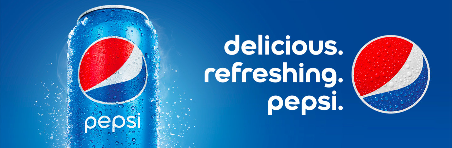
While sans serifs will be a popular choice, steer clear of the classics like Helvetica or Arial, instead opt for a little more fun and flair with clean and slightly rounded fonts as seen in Pepsi’s new branding.
Images
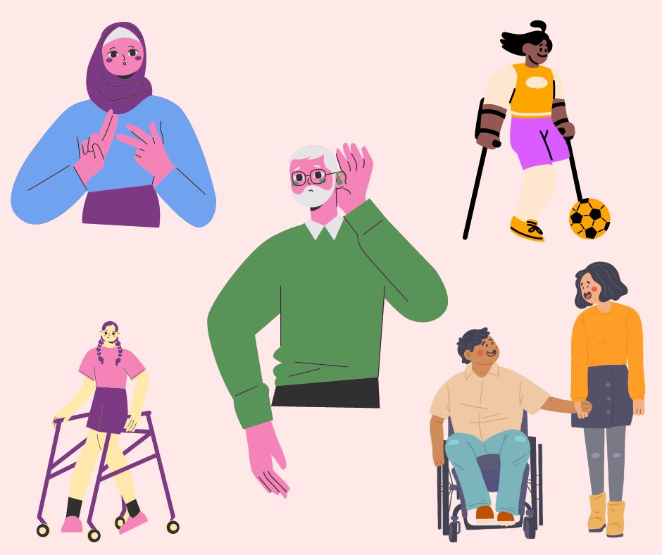
Inclusive Images
For graphic designers and marketers, it can be really challenging to source images online that accurately represent the diverse populations we’re trying to reflect. Thankfully more efforts are being made by brands and stock image sites to produce photos and illustrations that better represent the population.
In 2022, graphic design website Canva announced Canva Represents which has a mission to amplify creators and champion diversity. These efforts will surely continue in the new year with more accurate portrayals taking the main stage.
Photographic Branding
Branding is the personality of a company or product and good photography helps share that. Think Nike, and you’ll likely conjure up an image of a determined athlete, sweat dripping down their forehead.
Photos do something illustrations can’t, they bring brands to life. 2023 will see more brands use vivid photography to share their stories.
Google’s 2022 Superbowl ad “Seen on Pixel” perfectly sums up what we’re going to see in 2023: inclusivity and beautiful photography.
Themes on the Rise: Tech Central
AI Generated Artwork
If you’ve scrolled your feed in the last few weeks, you’ve surely noticed a flood of AI generated artwork. AI Art generators like Lensa and Midjourney offer users a simple way to get striking digital art pieces at a pretty affordable rate with just a few clicks.
Some controversy remains as to the ethics of such apps as many of the AI are trained using actual artist’s work and learn to replicate art styles. That being said, we predict this is a trend that will continue well into 2023 and seep into graphic design and marketing materials.
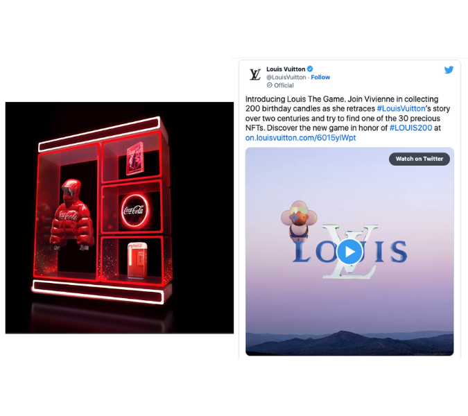
The Metaverse
2022 was the year of tech, with the NFT craze, the rise of AI generated artwork and increased interest in the escapism of virtual and augmented reality.
Brands are looking for ways to hop into the Metaverse. Whatsapp integrated virtual avatars, Wendy’s created a character on Fortnite and arcade game pioneer Atari offered a collection of NFTs based on classic games.
This surge of all things cyberspace will seep into graphic design as well. Think fluorescent colours, cyberpunk vibes, glitchy font and 3D illustrations.
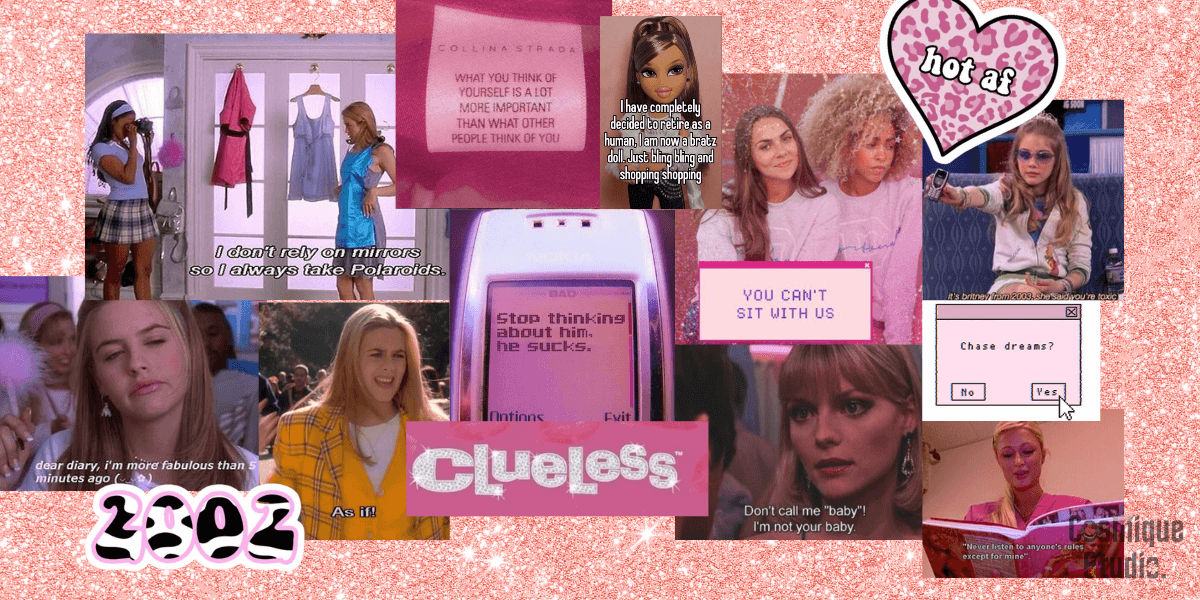
Nod to the Noughts
The early 2000s centered majorly around cyberculture. Kick-started with widespread Y2K panic, the noughties brought the world online with the dawn of chat rooms and social media, mp3 players and online gaming.
The early 2000s were filled with forward-thinking optimism - a world of opportunities on the information superhighway. Who didn’t love perfectly curating their myspace page? Now that was branding!
While most millennials will cringe at the thought of the early 2000s aesthetic, there’s no denying that this design style is making a comeback. We’re going to see fluorescent colour palettes, over-the-top typography and a nostalgic flair.
Easy, breezy, beautiful…
With financial uncertainty, climate change and the pandemic taking up our brain space, it’s no surprise many of us see the allure in a more minimalistic, natural or agrarian time.
A stark contrast to the previous future-focused trend prediction, expect to see a lot of earth tones, cheerful botanicals, and clean crisp designs.
Going Green
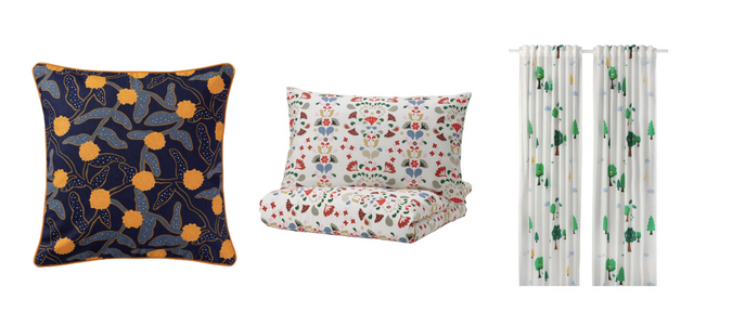
Sustainability is all the rage. Furniture giant IKEA continues their branding efforts towards a more earth-friendly tone. Just a few weeks ago, they launched their “Green-Friday” Campaign encouraging consumers to live more sustainably.
Other majors brands are talking sustainability too. Starbucks is testing recyclable and compostable cups. Royale now offers toilet paper and paper towels in plastic-free packaging and Amazon recently announced plans to switch to renewable energy for their global data centers. These efforts will surely be better with more “green-focused” packaging and branding.
Cut the Clutter
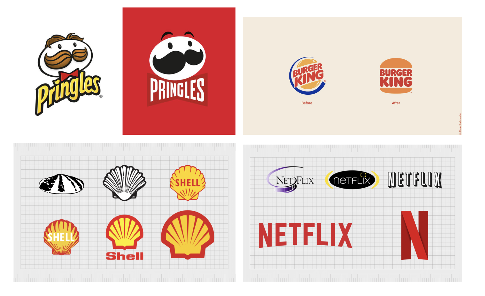
In the last few years, major brands have opted to simplify their branding. Pringles and Burger King rebranded with minimalist versions of their familiar logos. Other brands like Netflix, McDonalds, and Shell are going as far as just using a symbol or icon.
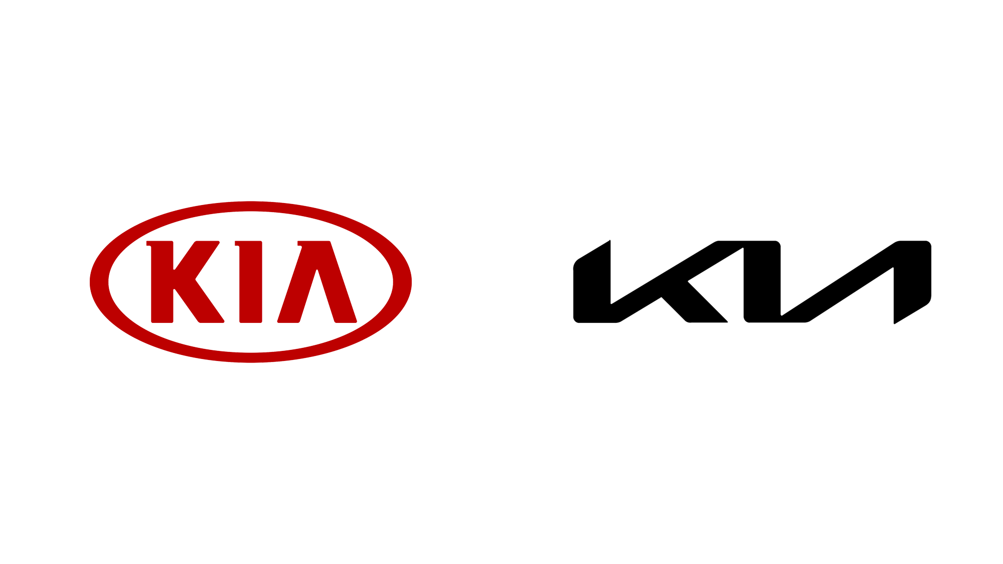
While “less is more” is a common theme in design, a logo is meant to tell a brand’s story and oversimplification can lead to confusion – looking at you Kia (or KN?)
The jury is still out on how simple is too simple, but this trend will likely stick around into 2023 and beyond.
Don't Miss the Latest Graphic Design Trends
While it’s fun to keep an eye out on design trends, it’s also important not to feel like you have to reinvent the wheel. See what’s trending, and if you can incorporate some of these popular themes in your marketing, then great! If the new fads aren’t your vibe, that’s okay too. Good branding is authentic and genuine.
Trends are just that, they come and they go, but consistent clear branding identity stands the test of time.
Ready to see how we can help your designs in 2023? Drop us a line and let’s chat!
Did you like what you just read? Then sign up for our weekly digital marketing email newsletter and get the latest tips, insight, and strategies to grow your business online.
What's Your Brand? Find Out With These Questions
- by Chelsée Curé
By: Chelsée Curé, Branding Specialist
Your brand is not your logo.
Your brand is so much more than that. It’s not what you look like, but rather who you are as an organization.
Think of a brand you love, and come up with three adjectives to describe them. Rarely will those adjectives be entirely visual. Instead, you might think of the quality of the product or service, the way they make you feel, or even the type of client they cater to.
Our goal is to find out who your business is and how we want to be perceived. Then it’s a matter of ensuring that your audience comes up with the same list of adjectives.
Building your brand means building on authenticity.
Brands that stand the test of time tend to have a common thread in that they don’t cater to the whims of what’s ‘hot’ right now, but instead deliver a consistent brand identity that stands the test of time.
This doesn’t mean forging forward with blinders on. Audiences value a brand that is aware of the current times we’re living in. It’s just a matter of finding a way to take a trending topic and make it fit your brand rather than the other way around.
Consider me a self-help guru for your business. Let’s do a deep dive into who you are, what you want to bring to the world and what unique viewpoint you want to share with your industry. Then we use our marketing tools to generate leads and build strong client relationships.
Here are some questions to ask that may help get the ball rolling.
Who are you?
This one might seem simple enough to answer. If you’ve reached the point of needing branding work. You’ve probably hammered that elevator pitch into the ground, but let’s dig a little deeper shall we?
What would make your brand want to get out of bed in the morning? Is it a drive for cutting-edge technology, a passion for improving the lives of customers, or a vision for a greener world?
This business was started for a reason. Let’s make sure we don’t forget it.
Now that we know your ‘why’, let’s talk about your ‘how’.
What words would you use to describe your business? Personify it!
If you were to describe your business as a friend, what kind of person are they?
- Are they a powerhouse that’s driven to succeed?
- Are they warm and friendly?
- Are they better suited for a black-tie event or a backyard barbecue?
- What do they sound like?
- Do they use language that’s witty and fun or are they more professional and prefer to stick to business?
- Are they bright and colourful or do they stick to minimalistic neutrals?
Hopefully by this point, you’ve got an idea of the type of persona you see for your brand and how you want to present it to the world.
Who are they?
They’re out there. They are your customers, your competition, your cheerleaders and your critics. Who are they and what do they want?
Customers
Who is your ideal customer and what do you bring to the table that meets their needs? What are their values and priorities and how do they align with yours?
By clearly identifying who the target audience is, we can make sure we create messaging that resonates with them. Are they looking for something bold and engaging, or warm and comforting? Are they urban or rural? Do they prefer brick and mortar or a digital experience? If they’re online, on which platforms are we likely to find them?
It’s possible that you have multiple customers in mind, and that’s okay too. What is important is being aware of who we are trying to reach and what will pack the most punch?
Let’s say you sell light fixtures, you might have residential customers who are designing their home. They’re focused on finding something that reflects their design style and budget. Their needs might be different than that of an industrial client who wants to buy in bulk and whose focus is to keep energy costs down.
The messaging you would use for these two clients may be very different, but it’s important to know who we’re talking to.
Competition
Who is your competition? How are you different? Where are their strengths and in what ways can you learn from them?
Conducting a competitive analysis is a great way to gain insight. You might see competitors who have a great product but an inconsistent brand identity and who struggle to stand out. Alternatively, you might find a competitor who’s killing it online, they’ve got great visuals, a strong online presence and little customer retention due to a lack of quality.
If you look at the current landscape of your industry, where are customers congregating and where is there a lapse? How can you set yourself apart from competition while getting a slice of that pie?
Cheerleaders and Critics
Most of us will likely never own a Lamborghini, but we all have an opinion as to whether we would want to. Cheerleaders and critics are those who may not fall into our customer base but who are part of the community. They may also be neither cheering nor criticizing but I appreciate alliteration.
This category casts a wide net. It might include things like media outlets and how current events may affect your brand.
If you plan on having a strong online presence, that means just about anyone can virtually walk into your space. They might not be looking to buy, but how will your brand make them feel?
It’s important to be cognizant of this group as they can easily influence your target audience. We’ve all seen or heard of companies going viral for a clever campaign or being called out for content that was deemed out of touch or inauthentic.
Where do we fit it?
We’re here to help guide you on your business’ journey of self-discovery.
Fact-Finding Mission
We’ll work with you to answer all the questions asked above. We’ll conduct competitive analysis, market research and find out what your business goals are.
The Holy Grail
Once we’ve established where your business fits among your industry and community. We’ll develop a brand standards guideline. Here are some things to include in the guideline:
- Your brand’s mission, vision, values and history
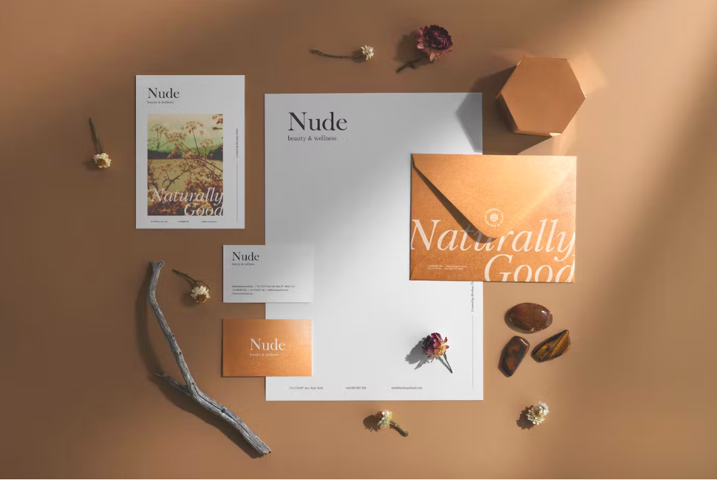
- Logo usage guidelines, size colour combinations, sizing requirements and more. This includes letterhead, website logo and business card designs
- Typography: what fonts and type sizes to use online and in print
- Your marketing materials colour palette, including colour codes and examples
- Examples of imagery to use (icons, photos, symbols etc)
- Messaging style guide: key messages, tone of voice and communication style. This could include a list of key points to emphasize or words to stay away from
This brand strategy guideline is a work in progress and as we work together and gain further insight, we’ll work to refine it to best fit your needs.
Telling your story
It’s time to tell your story.
We’ve established a strategy to best reach your audience and meet desired goals. Now, we’ll develop campaigns or content strategies that let people know who you are and how you can improve their lives.
We’ll create campaigns to run on the most optimized platforms for your needs. Well track their successes and evolve as we learn what works best for your goals.
Some examples include:
- Social media campaigns
- Blog posts and newsletters
- Digital marketing & e-commerce
- Search, SEO & SEM
Measurable Success
What sets Starling Social apart is our desire to keep you in the loop. We provide clients with transparent reporting so they keep their fingers on the pulse and aren’t left with questions.
Our reports include:
- Wins: why we succeeded, what made this strategy work, how can this approach be applied to different areas
- Losses: What missed the mark, what factors contributed to this campaign not doing what we’d hoped
- Next steps: With all the data we’ve gathered, what are the next steps?
If you’re ready to learn more about our branding and visual strategy services, click here to book a free discovery call!